

What is data visualization?
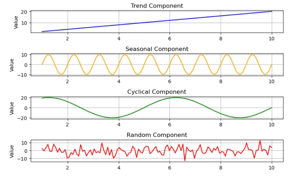
For years, we have been using charts, graphs, maps to visualize data. This adds meaning to the data we collect and makes decision-making easier. Basically, we are talking about trend, cyclical, random, and seasonal patterns. For further study, some examples of these patterns are given below.
As data analysts, we use bar charts, pie charts, stacked bar charts, scatter plots, heat maps, etc. This representation allows the audience to simply describe anything complex. It’s also a great tool for forecasting.
Criteria for choosing a data visualising tool
- Data Sources
When choosing a data visualization tool, it’s important to see if it suits you technically. You may use data sources such as Excel spreadsheets, notebooks, or SQL databases. Accordingly, choosing a tool that can open the data file and work without problems is necessary.
- Scalability
If you are using software like Excel, you have a data input limit. Therefore, it is not suitable for handling large datasets. You need to look for the appropriate software to handle a large database.
- Type of visualization
For example, some data visualization tools do not provide geospatial maps, 3D charts, etc. So, you must turn to the appropriate tools.
- Cost
Some data visualization software requires a subscription to get a specialized graph. They are not included in the free plan. If we unknowingly import and visualize our data after the pre-processing step, it is a huge waste of our time. And if we get something in money, we must be careful if they offer features that fit the money.
- Performance
As data scientists or analysts, we always deal with a large amount of data. Sometimes, we spend hours trying to get a proper model. But if our tool crashes in the middle, then our precious time is wasted. That’s why it’s best that we always use a tool that delivers output fast without crashing.
Day by day, software developers are developing new software for data visualization. But we will tell you about some of the tools currently used in the field. If you have experience with this tool, do not forget to comment below.
Top 5 data visualization tools
- Tableau
You can import data from data sources such as Excel and SQL. You can easily compare visualizations by creating a connection between the data table. You can also customize dashboards and charts according to your preference. Today, this is used in the field, so you can find the learning resources easily.
Advantages
Ability to handle large dataset
Providing interactive visualization
Disadvantages
Need to work hard to study advanced features
Cost of getting the software
- Microsoft power BI
This is a Microsoft tool, so you can easily work with Microsoft tools like Excel, Azure, etc. Most data visualization is optimized not only for dashboard desktops but also for Microsoft Power BI mobile devices. Therefore, it is possible to easily access dashboards. This is important for accurate forecasting because AI and machine learning features are provided.
Advantages
Ability to make maximum use of the amount invested
Ability to use easily without any experience
Disadvantages
Low performance compared to tabular
Advance, a paid subscription must be bought to get complex charts.
- Python Libraries
Libraries such as Matplotlib, Seaborn, etc., are widely used for data visualization. Each of these libraries is used for different requirements. Matplotlib can visualize data through bar charts, pie charts, stacked bar charts, etc.
Advantages
Being Python-free and open source
Being able to get more interactive visualization
Disadvantages
Data visualization is done using coding, so it takes longer than those like Power BI.
You need a good ability to handle Python to achieve professional-looking data visualization.
- Excel
Excel is one of the simplest software programs for data visualization, and even those who do not have prior knowledge can learn it within a few hours. Today, this software, used by the lowest to the top employees in any field, is very user-friendly and simple. It can visualize data like bar charts and pie charts and even contain features like adding titles, labeling, etc.
Advantages
Being simple and easy.
There is no additional cost, as the Microsoft package comes with it.
Disadvantages
Limiting the number of charts that can be visualized
Difficulty transacting with a large dataset
- R-Studio
RStudio is an integrated development environment (IDE) for the R programming language. Here, Data analysis is often used to check a hypothesis and compare two or more sample data groups. Data visualization is often used to visualize scatter plots, histograms, etc.
Advantages
Ability to perform any complex visualization.
There is a community with knowledge about this on social media and educational learning websites, so the necessary resources are easily available.
Disadvantages
It takes some time to create complex plots
Need a good computational power to work with a large dataset
Conclusion
According to the software mentioned above, the tools required for different functions vary. However, software such as Power BI and Excel has become necessary in any field today. In fact, the business community needs visualization to be forecasted by trend analysis.